Brand guidelines
A visual foundation connecting the Metabolic website, campaigns and patient-facing digital experiences.
Brand system, visual guidelines and cross-channel art direction
Keep the brand recognisable
A health brand appears in many places, from a first campaign impression to a detailed service page. Metabolic needed a shared visual language that could hold those touchpoints together.
A practical visual foundation
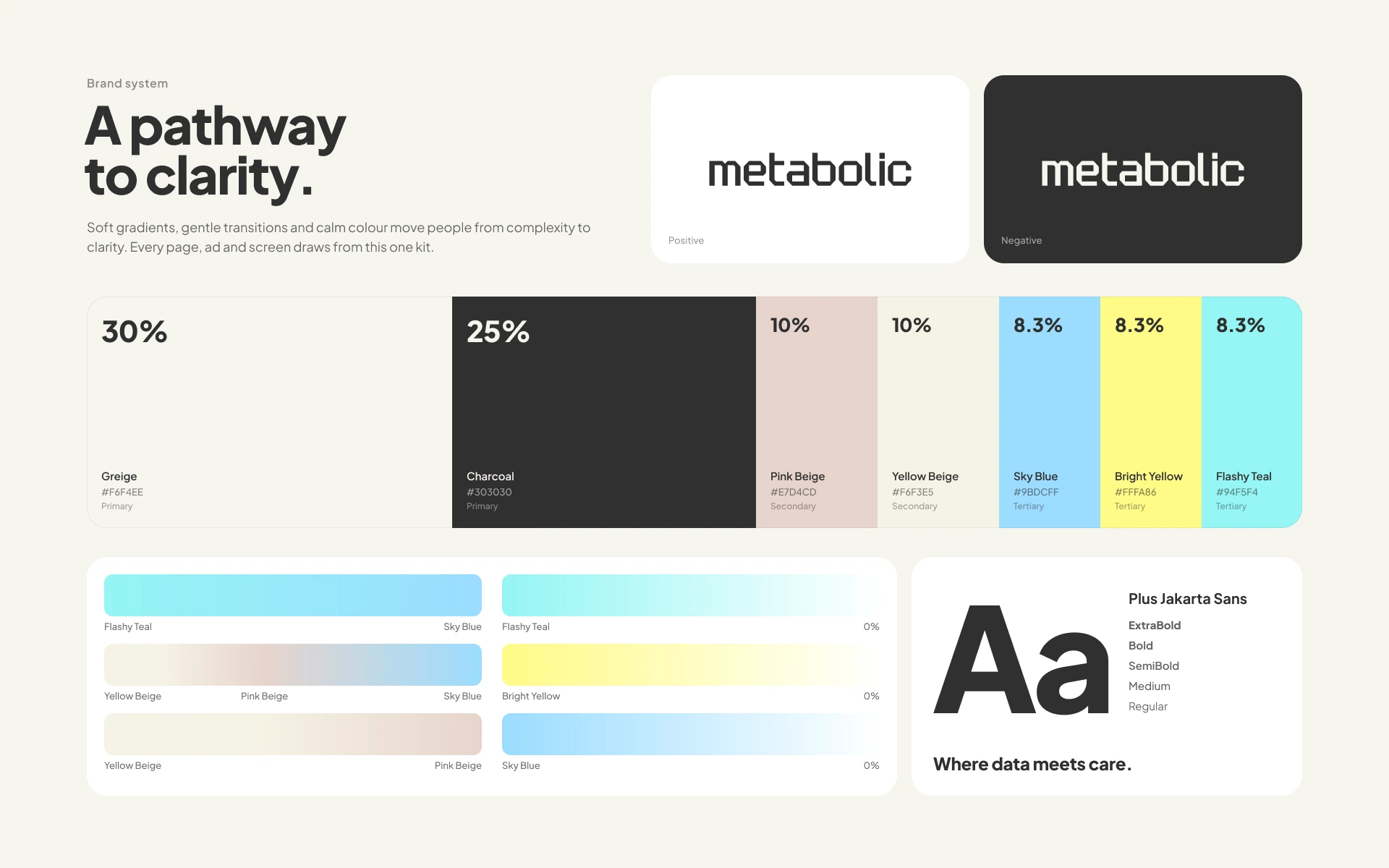
I developed the colour, typography and visual guidance around a calm neutral base, with brighter accents for information and emphasis. The logo, palette, gradients and Plus Jakarta Sans typography form a consistent starting point.
From guidelines to everyday work
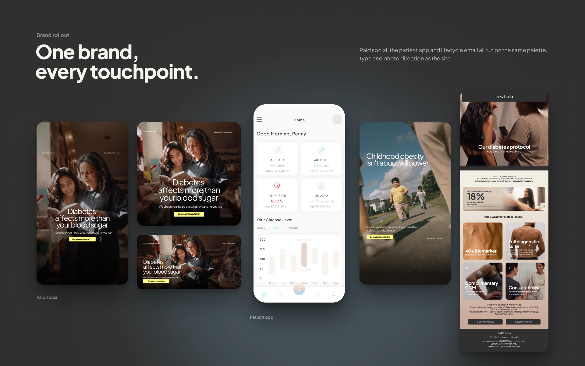
The system carries into website layouts, campaign assets and patient-facing interfaces. The aim is a recognisable brand that remains flexible enough for different messages and formats.
Credits.
- Brand system, visual guidelines and cross-channel art direction
- Saju Thomas Paul
One brand, every touchpoint.
The visual system applied across campaigns, the patient app and website.